Rebranding IKEA: Bridging Tradition with Modern Appeal
I undertook a transformative journey to rebrand their iconic identity, infusing it with a contemporary aesthetic while honoring their commitment to affordability and user-friendly assembly. The goal was to rejuvenate IKEA's image to resonate more deeply with a younger demographic without compromising its core values. Drawing upon IKEA's rich heritage and global influence, I focused on simplifying and modernizing its visual identity. Emphasizing clean lines, bold typography, and a refreshed color palette, the new brand identity exudes simplicity and sophistication. This approach aimed to enhance IKEA's appeal to the younger audience while maintaining its reputation for accessible design and eco-friendly practices.
-
Visual Identity: Redesigned logo and visual elements that reflect a contemporary aesthetic.
Color Scheme: Updated color palette with vibrant yet harmonious tones to attract a younger demographic.
Typography: Modernized typography for clarity and impact across all communications.
Packaging Design: Streamlined packaging solutions that enhance usability and sustainability.
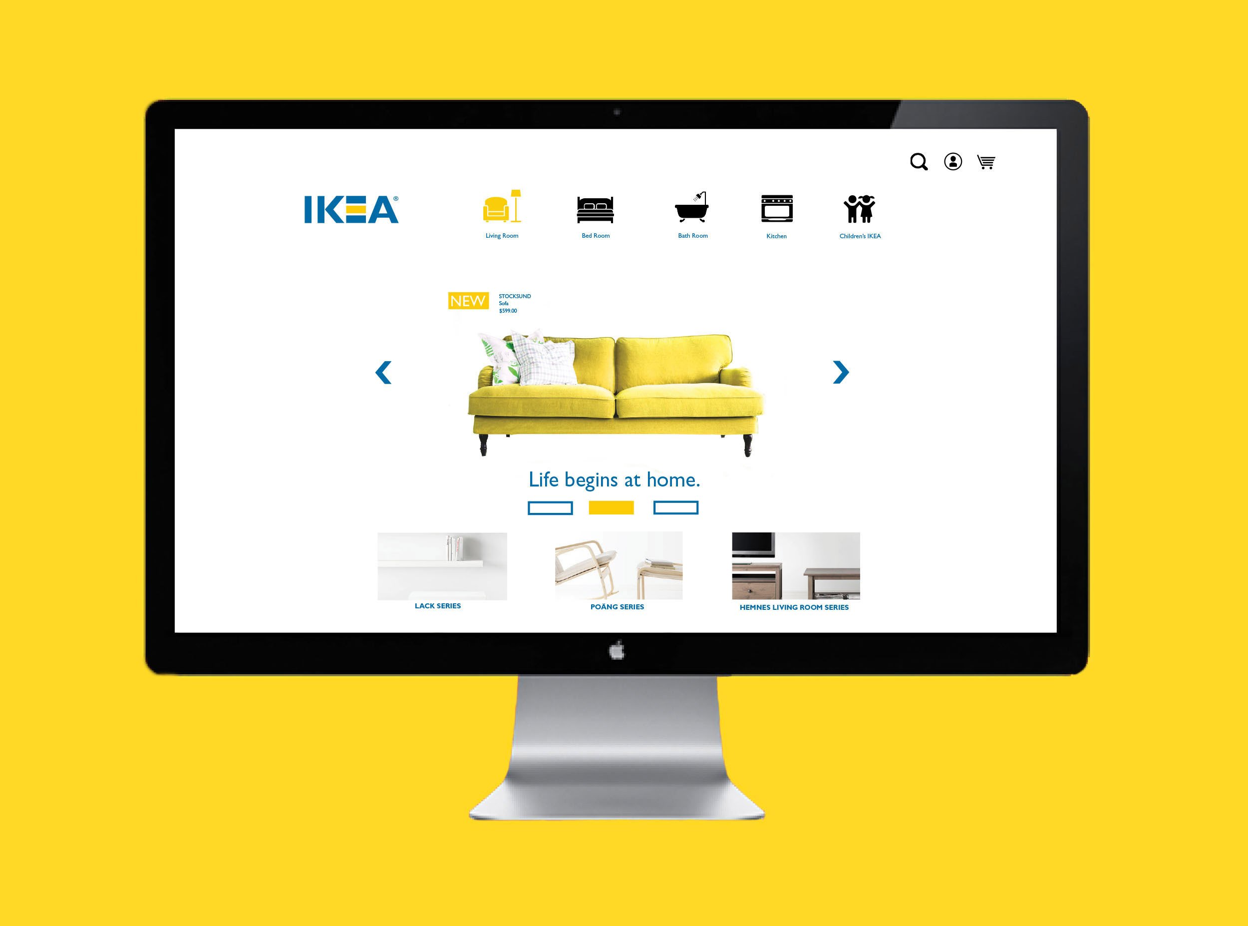
Digital Experience: Enhanced online presence with a user-friendly interface that facilitates seamless shopping and engagement.
-
The rebranding initiative revitalized IKEA’s brand image, resonating strongly with millennials and Gen Z. The cleaner, fresher, and more modern look not only attracted a younger audience but also reinforced IKEA's position as a leader in affordable and sustainable home furnishings.
-
Through strategic design decisions and a deep understanding of IKEA's ethos, I successfully reimagined IKEA's brand identity to appeal to a new generation of consumers while staying true to its core values. This project exemplifies my ability to blend creativity with practicality, delivering impactful solutions that drive business growth and customer engagement.